


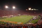

As a massive Pittsburgh sports junkie and former studio artist, finding the artistic qualities of our local teams is always a trip. What initially comes off as mere athletic contests can be viewed on several different levels, until we appreciate the full spectrum of what these sports offer.
“Don’t judge a book by its cover.” Except that’s the easiest and most fun thing to do in the world. We all have first impressions, and it’s impossible to deny our initial observations about anything. In sports, we see the uniforms and jerseys, which ties our teams to our cities and can be the first thing we either enjoy or criticize.
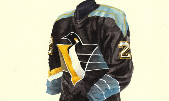
The Steelers have kept a pretty standard design throughout their modern history. The Pirates went red at some point. The Penguins had different blues at different times. You may love or hate, but you know you know.
I came across this site last night, where they’ve got a number of individual sports jersey watercolors for sale. Each professional team included has a full library of the changes and tweaks to these local sports jerseys, dating as far back as the inception of the franchises. The thing that stuck out most to me is the high number of jersey designs for the Pens during the 1990s after winning back-to-back Cups. Sure, we remember seeing all those jerseys, but catching the differences in one place is startling. With the change to the new RBK jerseys, the Pens only had 1 major design change in the 2000s. Times have changed.
Pens watercolors are here. Steelers here. Pirates there.
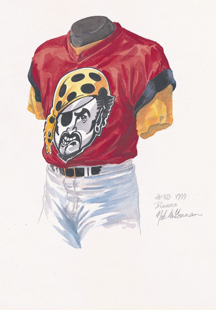
Kinda forgot about this Pirates monstrosity from 1999. I wonder why?