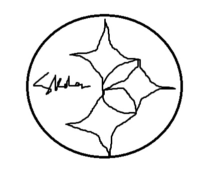
Let’s face facts, drawing the Steelers logo is hard. Here, check out my rudimentary logo that I just made in MS Paint:

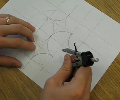
The hypocycloids always come out all messy and disproportionate. And as a former artist, I enjoy when people can make a drawing look as close to the intended subject as possible, unlike my weak effort. Plus, you know I only post awesome stuff that holds my attention, and I was positively enthralled by this video.
Mostly because compass skillz blow my mind.
***


